
.svg)
How to Customize Slider Navigation Dots in Webflow

At Paddle Creative, we understand that attention to detail can make all the difference in web design. One such detail is the slider navigation dots in Webflow. Today, we'll guide you through customising the size and shape of these dots to enhance your website's visual appeal.
Introduction
Slider navigation dots are a subtle yet important element in any slider component. By customising these dots, you can add a unique touch to your sliders, making your site stand out. In this guide, we'll show you how to modify the size and shape of slider navigation dots in Webflow using custom embed code.
Step-by-Step Guide
Step 1: Access Your Project
To get started, open your Webflow project, where you have the slider component you want to customise.
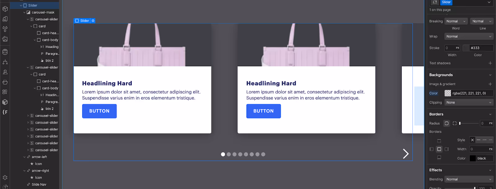
Step 2: Add Custom Embed Code
- Navigate to the Slider Section:some text
- In the Webflow Designer, locate the section containing your slider.
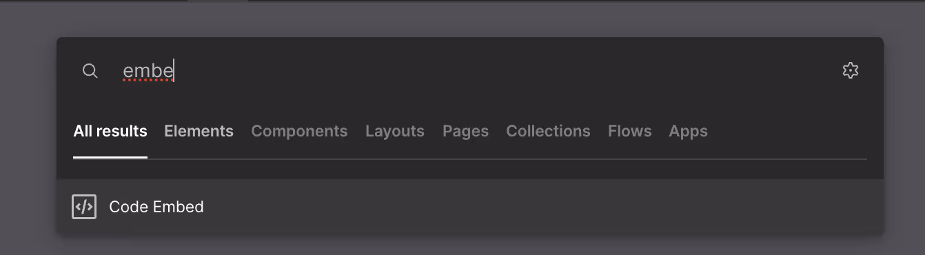
- Add an Embed Element:some text
- Drag an Embed element from the Add panel into the slider section. This will allow you to insert custom HTML, CSS, and JavaScript.
Step 3: Insert Custom CSS
Within the Embed element, you can add CSS to style the navigation dots. Here’s an example of how to do this:
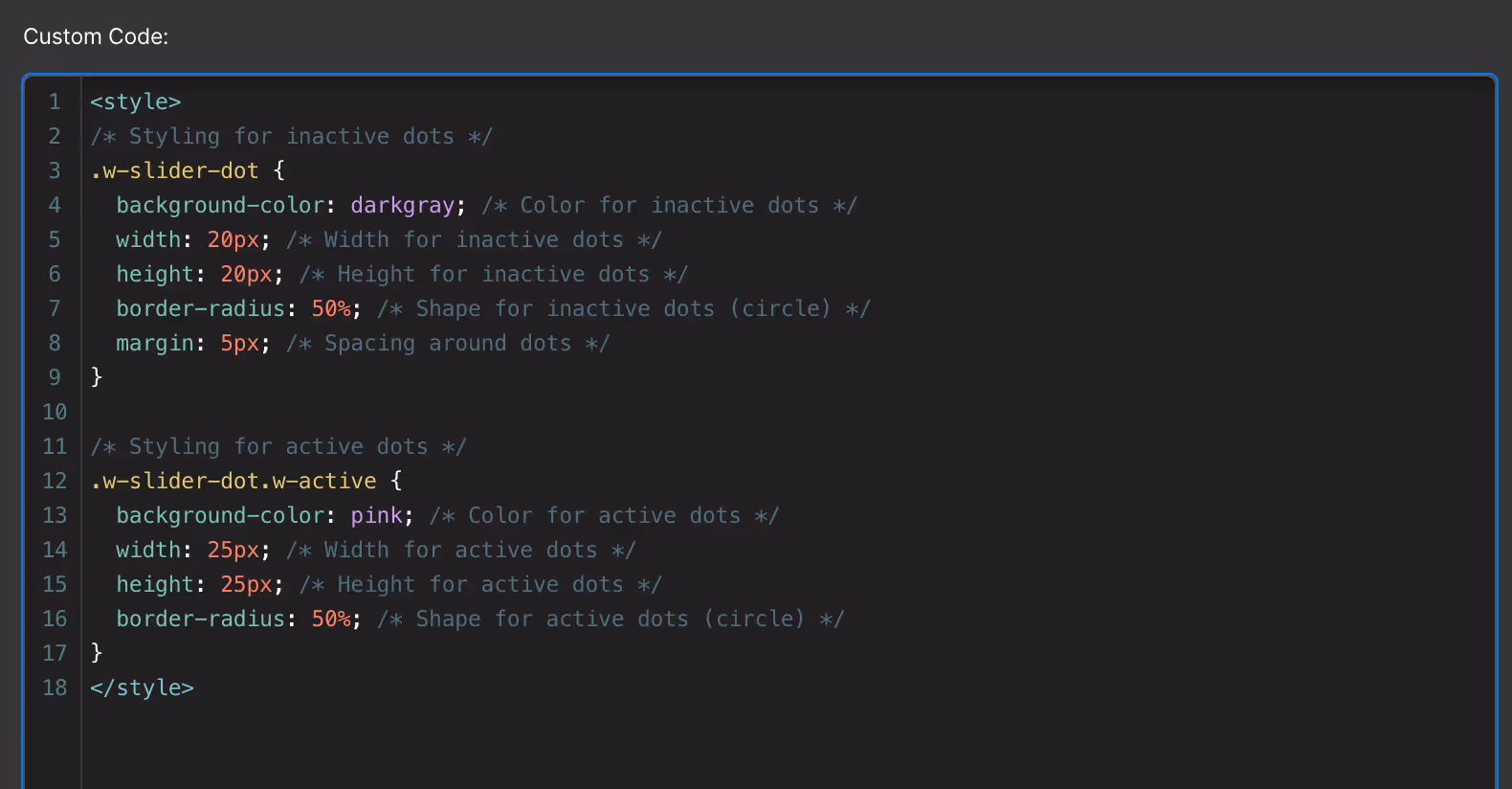
Note: Change the background color for the active and inactive dot to customize. You can also paste in the hex code for a color of your choice.
This CSS code will customize the appearance of both inactive and active slider dots. Adjust the values to suit your design needs.
Tip:
You can style the slider dots directly in Webflow and then grab the CSS from the CSS preview panel in Webflow. Use that code in your custom slider dot code and delete the original slider dot you created. This approach allows you to leverage Webflow's visual design tools while still customizing your dots with precise CSS adjustments.
Step 4: Save and Publish
Once you’ve added the custom code, save your changes and publish your site to see the updates live.
Step 5: Fine-Tuning
You might need to tweak the CSS values to get the exact look you want. Here are a few tips:
- Changing Shape: Adjust the border-radius property. For example, border-radius: 0; will make the dots square, while border-radius: 50%; makes them circular.
- Adjusting Size: Change the width and height properties to make the dots larger or smaller.
- Color Customization: Use the background-color property to set different colors for active and inactive dots.
Example: Creating a Custom Look
Let's walk through an example where we create a unique rectangular look for the dots:
- Inactive Dots:some text
- Set the width to 30px and height to 10px for a rectangular shape.
- Use a light gray color.

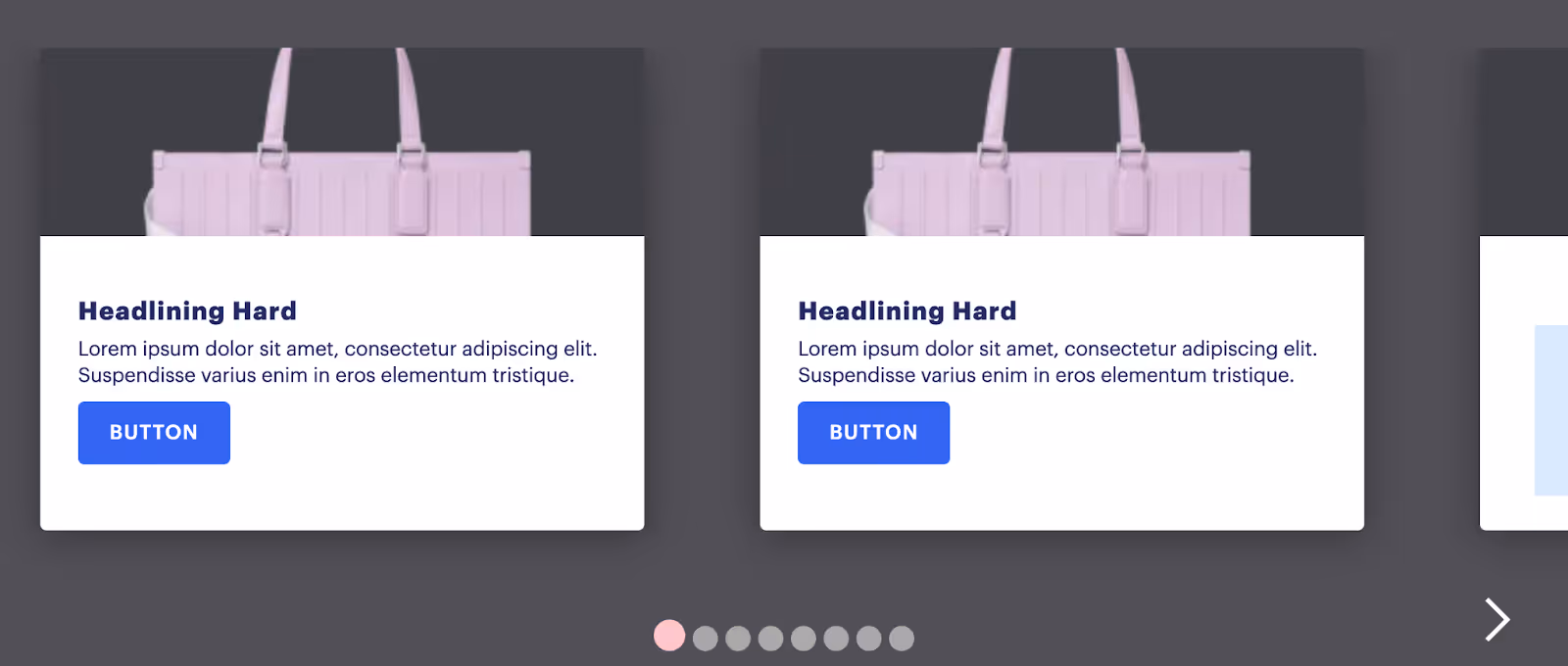
Viewing the Changes
After updating the code, save your changes and publish your site. Navigate to the slider component to see your customised navigation dots in action. Adjust the CSS further if needed to perfect the design.
Conclusion
Customising slider navigation dots in Webflow is a straightforward process that can significantly enhance your website's visual appeal. At Paddle Creative, we aim to empower you with the tools and knowledge to create stunning web designs. We hope you found this guide helpful.
Thank you for following along, and happy designing!
For more tips and tutorials, visit our blog or contact us at Paddle Creative. Let’s make your website stand out with unique and creative design elements!

.jpg)
%20(1)%20(1)%20(1).jpg)
.jpg)
%20(1).avif)
.avif)
.avif)


