
.svg)
A Beginner's Guide to Building Landing Pages with Webflow

Having an effective online presence is crucial for businesses and individuals alike. One of the most important elements of any online marketing strategy is a well-designed landing page - a standalone web page designed to capture leads or promote a specific product or service.
Building landing pages used to require coding skills or expensive web developers, but with tools like Webflow, it makes creating a beautiful and functional landing page more accessible to more businesses. In this beginner's guide, we'll explore the basics of building landing pages with Webflow.
Understanding Webflow
Webflow is a powerful web design and development content management system (CMS) that allows users to visually design, build, and launch websites with low code. It offers a user-friendly interface and a visual canvas that makes it easy for beginners to create professional-looking websites. As well as providing a wide range of pre-designed templates and customisable elements, Webflow also enables users to design their websites from scratch, making it an ideal choice for building landing pages.
Planning Your Landing Page
Before diving into Webflow, it's essential to have a clear plan for your landing page. Determine its purpose, target audience, and desired actions you want visitors to take. Consider the key elements such as headline, compelling call-to-action (CTA), visuals, forms, and social proof.
Do you want visitors to sign up to a newsletter, buy an item, or join a group? Once you know the objective of the landing page, next you should create a low-fidelity wireframe.
Sketching out a low-fidelity wireframe will help you visualise the structure and layout of your landing page, focusing on the functionality and usability of the landing page without the distraction of finished visual elements. From there, planning the content you want to showcase on your landing page (we take a deeper dive into the elements to consider when building landing pages in our blog, Creating Killer Landing Pages for Your Website) and then creating a high-fidelity wireframe is a strong course of action.
We love creating low-fidelity wireframes at Paddle Creative. We use tools like Octopus.do and Figma to do this as it allows a collaborative and easy way to plan pages.
Matt Connelly, Paddle Creative Founder

Designing your Landing Page
Once you have created your landing page wireframe, it’s time to put it into action. With Webflow's intuitive visual canvas and user-friendly interface, businesses can create and design stunning websites from scratch without the need for extensive coding knowledge. This low-code approach enables users to easily manipulate the layout, add interactive elements, and incorporate custom features that truly reflect their brand's identity.
At Paddle Creative, we do our designing in Figma, a web-based design application, and then take the designs over to Webflow. Figma is a great tool and super for projects that need collaboration. Have a look at our Figma to Webflow service to learn more about our design process.
Building Your Landing Page
Once you've settled on a design, it's time to dive into the Webflow editor and start customising your landing page. Add and customise text, images, buttons, forms, and other components effortlessly. The editor provides a visual interface where you can edit and arrange elements using visual canvas functionality, making the process seamless and intuitive.
If you choose to create your designs in Figma, taking them over to Webflow is a walk in the park with Webflow’s, Figma to Webflow plugin. The handy plugin converts Figma layers into the HTML and CSS code that Webflow produces when you visually build your website, meaning you don’t have to recreate each design element one-by-one when you begin your build. This plugin streamlines the design process so you can focus your attention on the build rather than sifting through a jigsaw puzzle of elements and code.
With the Webflow editor's powerful style panel, you can fine-tune the appearance of each element by adjusting colours, fonts, sizes, and other visual properties. The editor also allows you to create responsive designs, ensuring that your landing page looks great on any device, from desktops to smartphones. Plus, you can preview your changes in real-time, making it easy to iterate and refine your design until it matches your vision.
Whether you want to experiment with different layouts, add animations, or integrate third-party tools or designs created in Figma, Webflow provides a robust set of features and integrations that give you the freedom to create a truly unique and engaging landing page experience.
Building the CMS
Now the static page has been built inside Webflow, you will need to build the CMS, which will be the source of data on the landing pages.
You will need to look in each section of the page and work out which page elements will need to be controlled by the CMS. This will most likely be meta data, images and text.
Once you have a list of CMS-driven elements, you need to create a collection inside the Webflow Designer.
Creating a CMS Collection
To start creating a CMS Collection, open the CMS panel and select the "Create new Collection" option in the top-right corner. The CMS interface will then allow you to construct your Collection.
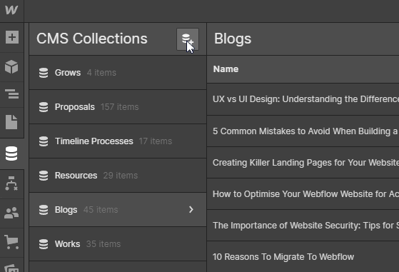
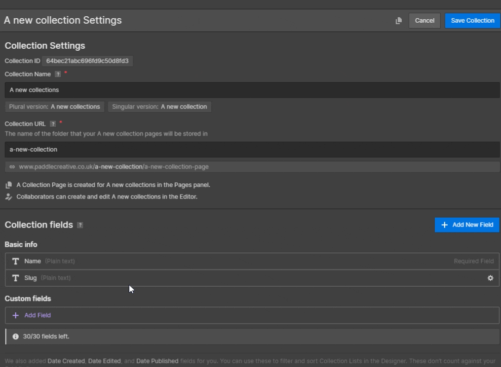
Now that you have created the collection, you will need to give it a name. You can input this name in the “Collection Name” field at the top of the page - make sure it is something clear and precise like, Blogs, Projects, Clients etc.
After you provide a name for your Collection, single and plural variants of the name are produced and utilised across the site. By clicking on the Plural version or Singular version beneath the Collection name box, you can additionally customise the plural and singular variants of your Collection name.
You then need to add fields to your Collection. These are the places your data will be contained. You can add various types of content fields including the following:

- Plain text - Best for simple or short pieces of text. Top tip - add these to add metadata fields for great SEO!
- Rich Text - Used for most large content areas within your landing page including links and embeds
- Image - Add images to your landing page to truly make each landing page dynamic and unique. Also great for A/B testing using different images
- Mult-image - Great for galleries and product showcases
- Video Link - Embed YouTube, Vimeo and other images directly onto the landing page
- Link - A simple link field to allow linking to other internal or external pages or a file, for example if your page contains gated content
- Phone / Email - Add contact fields
- Number - A great way to add a sort order to your CMS items
- Date/Time - Used for many reasons, such as blog date, or even events
- Switch - The most versatile field and is a great way to allow dynamic or customised action such as turning page sections on or off
- Colour - Allows you to customise certain parts of the page, from text to background colours
- Option - Can be used in various ways, from allow populating of different content pieces to showing different variations of a page section
- File - upload up to 4mb files such as PDFs and more
- Reference and Multi-reference - These are essential fields for advanced landing pages. You can reference another CMS collection to pull data from that collection. The most common use case is pulling an author from another CMS collection to a content piece but there are unlimited use cases for these fields and allow you to power up landing pages in Webflow.
Once the CMS is built, you should create at least one CMS item, or one version of that page inside the CMS Collection you have created. This way it will allow for a more realistic build when you bind the data in the next steps.
Once you have a CMS item added, navigate back to your page and copy all elements from that page into the Collection Template page.
Top Tip - Wrap all page elements inside a ‘page-wrapper’ div to make it easy to copy and paste the whole page into another page.
On your collection template page, with the design added, you now need to bind the data inside the CMS Collection to the elements on the page…
Binding Data Within a CMS Collection
One of the powerful features of CMS Collections is the ability to incorporate dynamic content into your Collection pages. By connecting elements within your design to Collection fields, you can create a versatile and scalable Webflow website. This guide will paddle you through the process of adding and binding content within a CMS Collection.
Step 1: Designing the Collection Page
You can approach designing a Collection page just like any other static page (pages made of ‘fixed code’) on your website. However, the true potential of Collection pages is realised when you want to introduce dynamic content into your design.
Step 2: Adding Static and Dynamic Elements
When you drop elements onto a Collection page, they are initially static. To make them dynamic, you need to connect them to a field from the Collection. This allows the elements to pull in data from the Collection items. Essentially, the Collection page serves as a template for all the Collection items.
Step 3: Connecting Elements to Collection Fields
To bind different elements in your design to Collection fields, follow these steps:
- Select the element on the Collection page that you want to connect.
- Click on the settings icon associated with the element. Alternatively, you can access the Element Settings Panel using the shortcut "D".
- In the settings panel, locate the option labelled "Get content from Collection" and enable it.
- A dropdown menu will appear, allowing you to choose the specific collection field from which you want to retrieve content.
Once an element is connected to a field, this association extends across all pages within the Collection. It ensures that the element dynamically displays the content from the corresponding field for each item in the Collection.
By binding data within a CMS Collection, you unlock the potential to create rich and adaptable websites. This enables you to seamlessly integrate dynamic content into your designs, providing a personalised and engaging user experience.
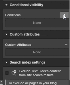
Conditional Visibility
Conditional visibility in web design refers to the ability to dynamically show or hide elements based on specific conditions or criteria. In Webflow, it allows designers and developers to create unique and personalised designs for Collection items or adjust section layouts based on different factors. By leveraging conditional visibility, websites can provide a more tailored and interactive user experience.
Using conditional visibility also allows your marketing team to quickly create pages that are different and fit the current page use case.
How it Can be Used
Whether it's changing section layouts, hiding sections, or pulling in data from other Collections, conditional visibility opens up a world of possibilities for enhancing user engagement and providing relevant information.
One common application of conditional visibility is to show or hide elements within a Collection list. For instance, if a certain condition is met, such as a specific tag associated with an item, an element like a button or an icon can be displayed or hidden accordingly. This feature allows designers to control the visibility of elements based on the content and context of the website.
Labels are another element that can be dynamically shown or hidden using conditional visibility. By setting up conditions based on specific criteria, such as the availability of a product, designers can display or hide labels accordingly. For example, an ecommerce website may show a "sold out" label when a product is unavailable, or display a "new" label for recently added items.
In the context of Collection pages, conditional visibility can be used to show or hide entire sections. This allows designers to customise the layout and presentation of Collection pages based on specific conditions. For example, an ecommerce website may display a "related products" section only if the current item belongs to a specific category or has related items available.
Optimising for Conversion
When building landing pages with Webflow, it's crucial to keep conversion in mind. Design your landing page to encourage visitors to take the desired action, whether it's making a purchase, subscribing to a newsletter, or filling out a form. Strategically place your CTA in a prominent location, using contrasting colours and compelling copy to make it stand out. You can design your CTA button in Figma and take the design over to Webflow. Paddle Creative can help with this process with our Figma to Webflow service.
Additionally, to build trust and credibility, consider incorporating testimonials, reviews, and social proof on your landing page. Highlight positive feedback from satisfied customers to show that your product or service is reliable and trustworthy. Webflow provides you with the flexibility to seamlessly integrate these elements into your design, allowing you to create a persuasive and conversion-focused landing page that drives results.
Mobile Responsiveness
When using Webflow to create landing pages, it is important to consider thoughtful website navigation to provide the best possible user experience (UX). This is particularly crucial on mobile devices, where space is limited and buttons and menus need to be compressed without sacrificing usability. Due to the challenges of touchscreen operation and thumb positioning, it is essential to make buttons and links large and distinct, ensuring users can easily find and tap them without having to zoom in.
To optimise mobile navigation on your Webflow landing pages, there are several strategies you can employ. Firstly, design finger-friendly buttons that are easily recognisable and accessible, allowing users to navigate smoothly without frustration.
Top Tip - WCAG 2.1 Accessibility Compliance states buttons should be at least 44 x44 pixels to be accessible on mobile devices.
Additionally, highlight the menu bar and important CTA buttons that direct users to the information they are seeking.
By drawing attention to these key elements, users can easily navigate through your landing page. Lastly, consider adding a prominent search bar, particularly useful on smartphones when visitors want to quickly find specific information, such as a particular Ecommerce item. This feature enhances user convenience and accelerates the information retrieval process.
Webflow empowers you to implement these mobile navigation techniques seamlessly, enabling you to create landing pages that offer an intuitive and engaging experience for users across various devices.
Integrating Forms and Analytics
Webflow provides built-in form elements that allow you to collect user data, such as email addresses or other relevant information. Integrate your preferred email marketing or CRM platform to seamlessly capture and manage leads. Additionally, set up analytics tools like Google Analytics to track visitor behaviour, conversions, and other important metrics.
A/B Testing
A/B testing, also known as split testing, is a powerful marketing strategy that compares two slightly different versions of a webpage to determine which one produces the highest conversion rate. Landing pages serve as an excellent platform for conducting these tests, allowing you to refine your calls-to-action (CTAs) and other elements for optimal performance.
While building your landing page, you may find yourself pondering various questions: What size should the CTA button be? Would a different headline lead to better conversions? Can an on-page countdown timer boost or hinder sign-up rates? Relying solely on intuition or web design best practices can only take you so far. If you want to uncover the truth and discover what truly works, you need to try A/B testing.
It's important to understand that A/B testing is not a one-time endeavour; it's an ongoing process that involves making incremental changes to your page to fine-tune your campaign for maximum conversions. Each test builds upon the insights gained from previous tests. Even a negative result is valuable as it provides valuable insights into what does not work, guiding you in designing your next test.
By utilising A/B testing on landing pages, you can systematically evaluate different variations of elements such as CTAs, headlines, layouts, and more. This data-driven approach allows you to make informed decisions, optimising your landing page to drive higher conversion rates. With tools like Google Optimize, you can easily set up and execute A/B tests, gaining valuable insights into your audience's preferences and behaviours.
Publishing and Optimising
Before launching your landing page, it is crucial to undertake a thorough review and testing process to ensure its quality and performance. Take the time to carefully review every element, checking for any errors, inconsistencies, or broken links.
Test the responsiveness of your landing page across various devices and screen sizes to ensure a seamless experience for all users and pay close attention to the functionality of any forms or interactive elements, verifying that they work as intended and capture user input accurately. By conducting these checks, you can ensure a flawless user experience and maximise the chances of achieving your conversion goals.
Once you are confident in the quality of your landing page, Webflow offers convenient hosting options to publish your creation. You can either use a custom domain to maintain consistency with your brand, or utilise a Webflow subdomain. This flexibility allows you to choose the hosting option that best suits your needs and aligns with your overall marketing strategy.
After publishing, it is essential to continuously monitor the performance of your landing page. Track key metrics such as conversion rates, bounce rates, and engagement metrics to gain insights into its effectiveness. Regularly analyse this data and make data-driven optimizations to improve the performance and success of your landing page.
With Webflow's intuitive publishing and hosting features, you can confidently launch and optimise your landing pages, ensuring they deliver a seamless user experience and drive the desired outcomes for your business.
Conclusion
Building landing pages with Webflow empowers website designers and developers of all levels to create visually stunning and high-converting web experiences without the need for coding expertise. With its intuitive visual canvas and a wide range of customisable templates, Webflow provides a user-friendly platform for designing and launching effective landing pages.
By following the steps outlined in this beginner's guide, you can create landing pages that engage your audience, drive conversions, and support your online marketing efforts. Remember to plan your landing page strategically, optimise for conversion, ensure mobile responsiveness, and integrate necessary forms and analytics.
With practice and experimentation, you'll be able to refine your landing pages and achieve the desired results. Start exploring the world of landing page design with Webflow and unlock new possibilities for your online success.
Have a query? Get in touch!

.jpg)
%20(1)%20(1)%20(1).jpg)
.jpg)
%20(1).avif)
.avif)
.avif)


