
.svg)
How to Optimise Your Webflow Website for Accessibility and Inclusivity
It is vital to ensure that your Webflow website is accessible for all who want to use it. This blog delves into some of the key things you can do to ensure your site is inclusive and accessible to an array of users.

.avif)
Introduction
In today's digital age, it is essential to prioritise accessibility and inclusivity when designing and developing websites. As a website owner or developer using Webflow, a powerful visual development platform, you have the opportunity to create websites that are accessible to a diverse range of users.
By following some key principles and implementing best practices, you can ensure that your Webflow website is inclusive and provides an excellent user experience for everyone. In this blog, we will explore practical tips and techniques to optimise your Webflow website for accessibility and inclusivity.
What is Website Accessibility?
The best place to start is understanding what accessibility means. Accessibility in websites refers to the practice of designing and developing websites in a way that allows everyone, including individuals with disabilities, to perceive, navigate, and interact with them effectively. It aims to provide equal access and opportunity, making sure everybody is able to obtain information, engage in activities, and participate in the digital world.
Web accessibility is essential for individuals with disabilities (i.e. visual, hearing, motor, and cognitive impairments) to access information, services, and opportunities online. It benefits not only people with disabilities but also older adults, individuals with temporary impairments, and those using different devices or network conditions.
Understand Accessibility Guidelines
To create an inclusive website, it might be useful to familiarise yourself with accessibility guidelines such as the Web Content Accessibility Guidelines (WCAG) 2.1. These guidelines provide a set of standards and recommendations for making web content more accessible to individuals with disabilities such as, perceivability, operability, understandability, and robustness, and ensure your website adheres to them.
It is also important to consider ADA compliance, which is the system for compliance with the Americans with Disabilities Act in the United States. ADA compliance ensures that individuals with disabilities have equal access to goods and services, including digital platforms. Non-compliance with ADA guidelines can have legal implications, particularly in states like California where it is illegal to have a non-compliant website.
Effective July 2019 onwards, California requires websites to meet the Web Content Accessibility Guidelines (WCAG) 2.0 standards. These guidelines, and the more recent WCAG 2.1, provide a set of standards and recommendations for making web content more accessible to individuals with disabilities, covering various aspects such as perceivability, operability, understandability, and robustness, and adhering to these guidelines can help ensure your website is accessible to a wider range of users. Services like AudioEye can provide assistance and tools to help achieve and maintain ADA compliance.
Key Aspects of Web Accessibility
Use Semantic HTML
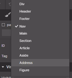
Semantic HTML refers to the use of HTML elements that convey meaning and structure to both humans and machines and is the foundation of an accessible website. When structuring your content in Webflow, make use of appropriate HTML elements like headings (H1-H6), paragraphs, lists, and semantic tags like <nav>, <header>, <footer> to convey the meaning and hierarchy of your content. Semantic markup helps screen readers and other assistive technologies understand and navigate your website effectively.
Screen readers are assistive technologies used by people with visual impairments to access and navigate web content. Semantic HTML elements, such as headings and lists, provide structure and meaning to the content and screen readers rely on this structure to interpret and present the information accurately to users.
Since different types of heading specify the outline of the page (e.g. H1 headings are used for main headings, H2 for headings and H3 for sub-headings and so on), using headings appropriately allows screen reader users to navigate through the page easily by skimming or jumping directly to specific sections. Properly structured headings also contribute to search engine optimisation (SEO) as they provide cues about the page's main topics and relevant keywords.
Semantic HTML also enhances user experience (UX). Users often skim web pages to quickly grasp the content and find the information they need. Headings serve as visual signposts that break up the content and guide users through the page. Well-structured headings make it easier for users to scan the page, identify relevant sections, and locate specific information quickly. This improves overall usability and user experience.
By utilising semantic HTML elements, you not only create an accessible website for people with disabilities but also enhance search engine visibility and improve the user experience for all visitors. It is important to understand and apply proper HTML semantics when structuring your website's content.
Provide Alternative Text for Images
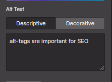
Images play a vital role in web design, but they can be a barrier for visually impaired users. To make images accessible, always include descriptive alternative text (alt text) for each image on your Webflow website. Alt text should provide a concise and accurate description of the image, conveying its purpose and context. This enables screen readers to read aloud the alt text, allowing individuals to form a mental image of the content and aid in their comprehension of the overall message or purpose of the image. Screen readers rely on alt text to describe images to visually impaired users. When an image has alt text, the screen reader will read aloud the alt text, allowing visually impaired users to understand the image's meaning and context. This ensures that the information conveyed by the image is not lost to those who cannot see it.
Alt text is not only important for accessibility but also contributes to SEO. Search engines rely on alt text to understand the content and relevance of images on a web page. Therefore, by providing descriptive alt text, you can enhance the discoverability of your website's images in search engine results.
When crafting alt text, it's important to strike a balance between being descriptive and concise. Ideally, alt text should convey the image's content, function, and context in a way that is meaningful to visually impaired users. Avoid using generic alt text such as "image123.jpg" or leaving the alt attribute empty, as this provides no useful information to screen reader users.
By including descriptive alt text for your images, you ensure that visually impaired users can access and understand the visual content on your website. This promotes inclusivity and a better user experience for all visitors, regardless of their abilities.
You can easily add alt text to images on your Webflow website inside Rich Text blocks by following these steps:
- Select the Image in your Rich text element
- Click the “wrench” icon
- Click the Alt text dropdown and choose "Custom description" to set custom alt text, or "Decorative" to set the image to decorative
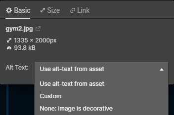
For other images in Webflow Designer, these can be managed inside the assets panel directly.
This handy Webflow resource page identifies the different ways to add alt text to different elements to your website, so if you’re unsure give it a read.
Create Captions and Transcripts for Media
Videos and audio content are increasingly popular on websites. To ensure that these multimedia elements are accessible to all users, provide captions for videos and transcripts for audio files. Captions and transcripts make your content accessible to individuals with hearing impairments and also benefit users who may prefer to read or who are in a sound-sensitive environment.
Captions are textual representations of the audio content in videos, they include dialogue, sounds, and other important auditory information. Adding captions to your videos benefits individuals with hearing impairments, as they can read the captions to understand the content. Captions also benefit users who may be in a noisy environment, those who prefer to read rather than listen, or non-native speakers who may have difficulty understanding spoken language. Providing captions ensures that the information conveyed in the video is accessible to a broader audience.
Transcripts are written versions of the spoken content in audio files, similar to scripts. They provide a textual representation of the audio, making it accessible to individuals who are deaf or hard of hearing. Additionally, transcripts benefit users who may have difficulty understanding spoken language, prefer reading, or need to refer back to specific information in the audio. Including a transcript alongside your audio files ensures that the content can be accessed by a wider range of users.
By providing captions for videos and transcripts for audio files, you make your multimedia content accessible to individuals with hearing impairments, as well as those who may have different preferences or constraints. This promotes inclusivity and ensures that everyone can fully engage with the information and messages conveyed through these media formats.
It's important to note that there are different methods of adding captions and transcripts to your website depending on the video or audio player you're using. Some players have built-in support for captions (which aren’t always accurate), while others may require separate caption or transcript files. Additionally, you can consider providing user controls to enable or disable captions, allowing users to customise their experience based on their needs and preferences.
Remember to make captions and transcripts accurate, synchronised, and appropriately formatted to ensure a meaningful and effective experience for users relying on them.
Design for Keyboard Navigation

Keyboard accessibility is vital for users who rely on keyboard navigation and don’t use a mouse or other pointing device, including individuals with motor disabilities. Ensure that your Webflow website can be navigated using only the keyboard. Test your website by using the Tab key to move through interactive elements, such as links and form fields. Focus indicators should be clearly visible so that users can easily identify the active element.
You can test your website's keyboard accessibility by using the Tab key to move through interactive elements, such as links, buttons, and form fields. The focus should move in a logical and predictable order, ensuring that all interactive elements can be reached and activated using the keyboard. Pay attention to the tab order and ensure that it follows the visual order of elements on the page.
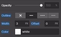
It's essential to have clearly visible focus indicators that indicate the active element as users navigate through your website using the keyboard. The focus indicator, often a visible outline or highlight, provides a visual cue that helps users understand where they are in the interface. Make sure the focus indicator has sufficient contrast and stands out from the background to ensure it is noticeable.
Consider including skip links at the beginning of your page, allowing users to bypass repetitive navigation menus and jump directly to the main content. Skip links are particularly helpful for users who rely on keyboard navigation as they allow them to quickly navigate to the core content of a page without having to tab through every navigation element.
By ensuring keyboard accessibility, you provide an inclusive experience for users with motor disabilities, as well as those who prefer or need to navigate using the keyboard. It's important to conduct thorough testing to ensure that all interactive elements are reachable and usable via the keyboard alone.
Webflow provides features and tools to assist with keyboard accessibility, including keyboard-friendly focus styles and the ability to customise tab order.
By leveraging these features and following best practices, you can create a website that is accessible and usable for all users, regardless of their preferred method of navigation.
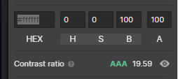
Ensure Colour Contrast
Proper colour contrast is essential for users with visual impairments, including those with colour blindness. Choose colour combinations that provide sufficient contrast between text and background elements. WebAIM's Colour Contrast Checker is a useful tool for evaluating the colour contrast ratio and ensuring compliance with WCAG standards.
Colour blindness affects a significant portion of the population, and it's important to design with these users in mind. Avoid relying solely on colour to convey meaning or distinguish elements. Use other visual cues, such as icons, patterns, or labels, in conjunction with colour to ensure information is accessible to users with colour vision deficiencies.
The contrast ratio is a measure of the difference in luminance or lightness between foreground (text) and background colours. The Web Content Accessibility Guidelines (WCAG) provide specific contrast ratio requirements to ensure accessibility. For example, WCAG 2.1 recommends a minimum contrast ratio of 4.5:1 for normal text and 3:1 for large text. However, it's best to aim for higher contrast ratios for improved readability.
Evaluation and testing: To ensure compliance with colour contrast standards, tools like WebAIM's Colour Contrast Checker can be valuable. These tools allow you to input colour values and assess the contrast ratio between the foreground and background colours. They also provide feedback on compliance with WCAG standards. Aim to achieve the recommended contrast ratios to ensure your content is accessible to users with visual impairments.
By considering colour contrast, you make your website's content more legible and comprehensible for users with visual impairments. This includes individuals with low vision, colour blindness, or other visual conditions. It's important to design with inclusive colour choices and test your website's contrast levels to ensure compliance with accessibility guidelines.
Webflow provides options to customise the colours of your website's elements, allowing you to choose colour combinations with appropriate contrast. By using accessible colour palettes and testing your design using contrast evaluation tools, you can create a visually appealing and accessible website for all users.
Webflow also has a built-in colour contrast checker that allows you to see live contrast accessibility as you design and build your website.
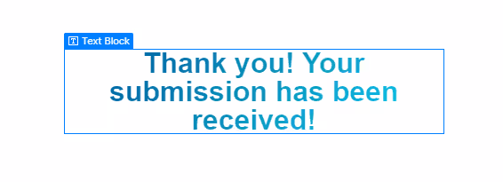
Make Forms Accessible
Forms are common elements on websites and should be designed with accessibility in mind. For ease of use, ensure that each form element has a proper label associated with it. Labels provide descriptive text that identifies the purpose, content and instruction of each form field and should be clear, concise, and placed near their respective fields. When implementing instructions, they should clearly indicate the expected format, required information, or any specific guidelines. Using explicit labels helps users, including those who rely on assistive technologies, understand the purpose of each field and complete the form accurately.
Whenever possible, use HTML form elements such as <input>, <select>, and <textarea>. As mentioned earlier, these elements are widely recognised by assistive technologies and provide built-in accessibility features. They ensure that screen readers and other assistive devices can accurately interpret and interact with the form fields, improving accessibility for users.
Another thing to consider is implementing validation for user input to ensure that the entered data meets the specified requirements. Validate input in real-time or upon form submission to check for errors, such as missing or incorrectly formatted information.
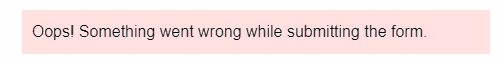
When errors occur, provide informative error messages that clearly explain the issue and guide users in correcting their input. These error messages should be associated with the relevant form fields and be distinguishable to users with visual impairments.
By considering accessibility in form design, you enhance the usability and inclusivity of your website. Proper form labels, clear instructions, and the use of HTML form elements facilitate user understanding and interaction. Validating user input and providing informative error messages assist all users, including those with disabilities, in completing forms accurately and efficiently.
Webflow offers form-building features that allow you to implement accessible form design practices. By leveraging these features and following best practices, you can create forms that are intuitive, informative, and accessible to all users.
Test and Iterate
Once you’ve established some of these features into your Webflow website, it’s important to test them to make sure they work as they should. Conduct manual testing using assistive technologies, such as screen readers, and engage with users to gain valuable feedback. Additionally, leverage automated accessibility testing tools like Lighthouse or WebAIM's Wave tool to identify potential issues. Continuously iterate and improve your website's accessibility based on the feedback received.
Conclusion
Creating an accessible and inclusive website should be a priority for every website owner and developer. By optimising your Webflow website for accessibility and inclusivity, you ensure that it can be accessed and enjoyed by a wider audience, including individuals with disabilities. Webflow has its own tips for creating an accessible website, check it out here.
Remember, accessibility is not a one-time task but an ongoing commitment. As technologies evolve and accessibility standards advance, it is essential to stay informed and update your website accordingly. By embracing accessibility and inclusivity in your Webflow website, you contribute to a more equitable online environment where everyone can engage with your content and services. Let's strive to make the web an inclusive space for all users, one accessible website at a time.

Author
%20(1).jpg)


.jpg)


.jpg)


%20(1).jpg)
%20(2).jpg)
%20(1).jpg)
.jpg)
.jpg)
%20(1).jpg)
.jpg)

.jpg)
.jpg)
.jpg)
.jpg)
.jpg)
%20(1).jpg)
.jpg)
%20(1).jpg)


.jpg)

%20(1).jpg)
%20(1).jpg)
%20(1).avif)


%20(2).avif)
.avif)


.avif)
.avif)
.avif)
.avif)
.avif)
.avif)
.avif)
.avif)
%2520(1).avif)
%2520(1).avif)
.avif)
%2520(1).avif)
%2520(1).avif)
%2520(1).avif)
%2520(1).avif)
%2520(1).avif)
%2520(1).avif)
.avif)
.avif)

.avif)


.avif)


